
Yours, Truly
Our focus is on you! We invest time up front with every client to get to know their story, their passion, and all the people who bring their vision to life. Valuably differentiated design arises from knowing who you are, your strengths, and where you are heading. Six Blooms is invested in creating work to support an endeavor that is truly yours.
Read below for a few examples of our collaborations with other clients.
vidcad
- Brand Strategy Workshops
- Tagline
- Product Naming
- Identity and Touchpoint Development and Design
- Launch Email Developement
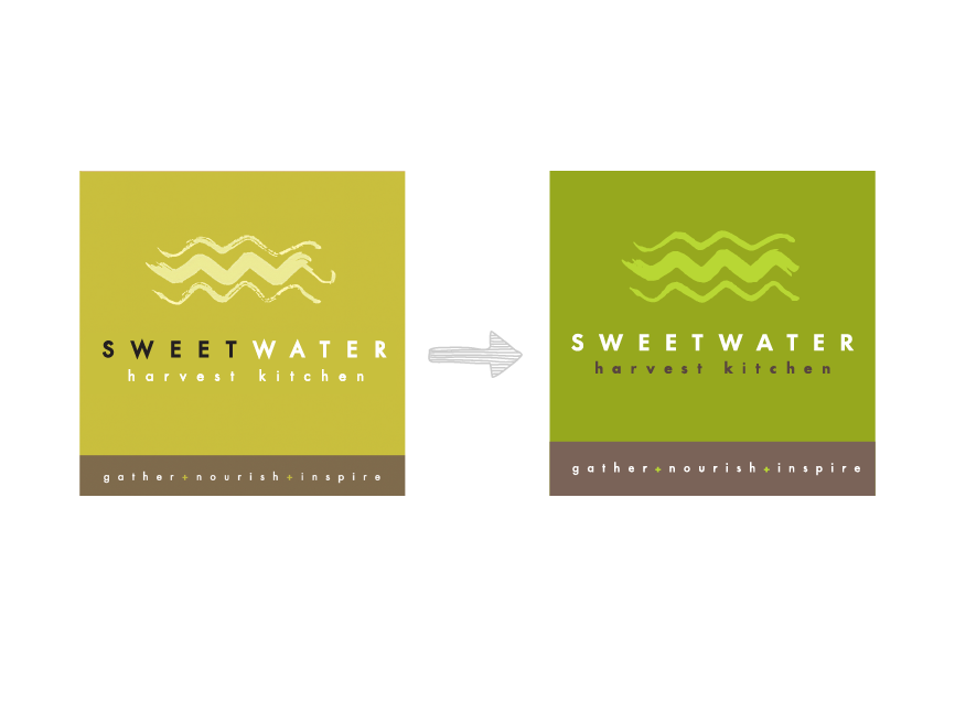
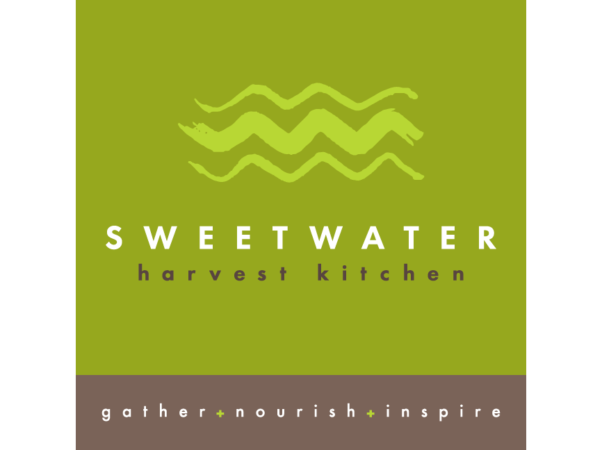
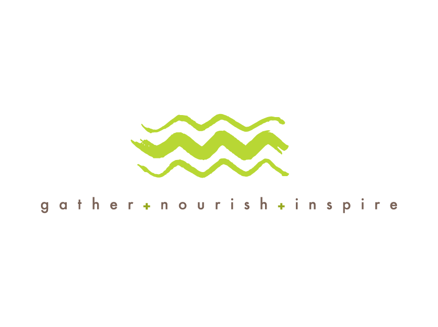
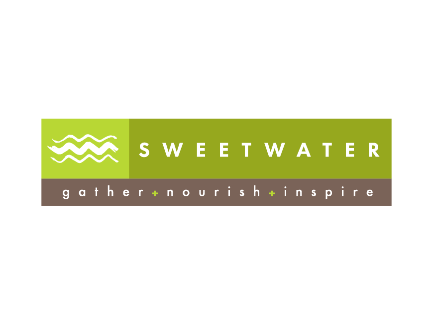
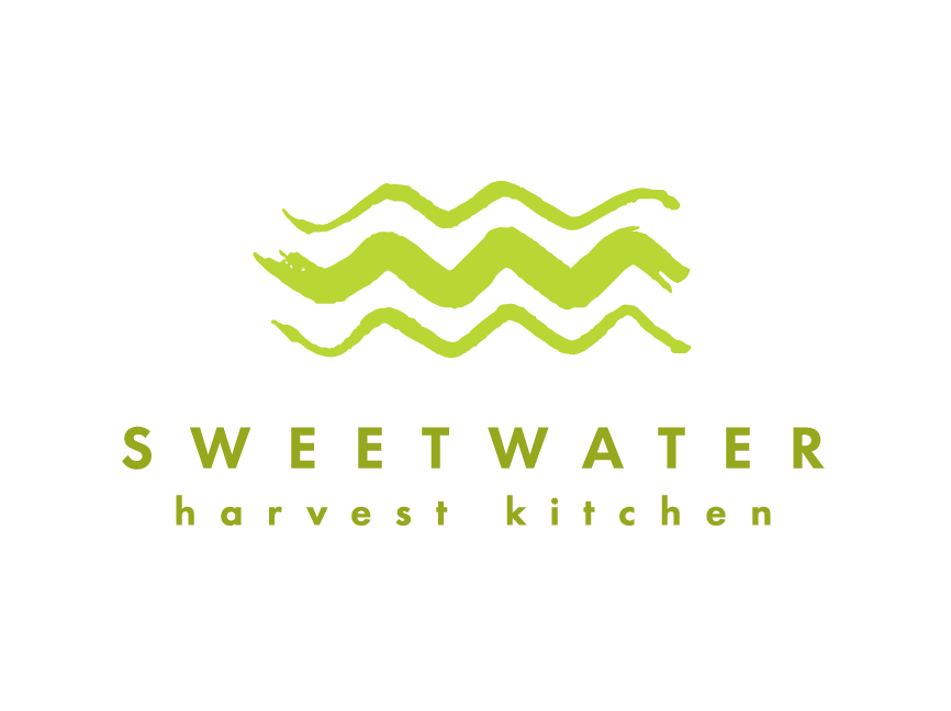
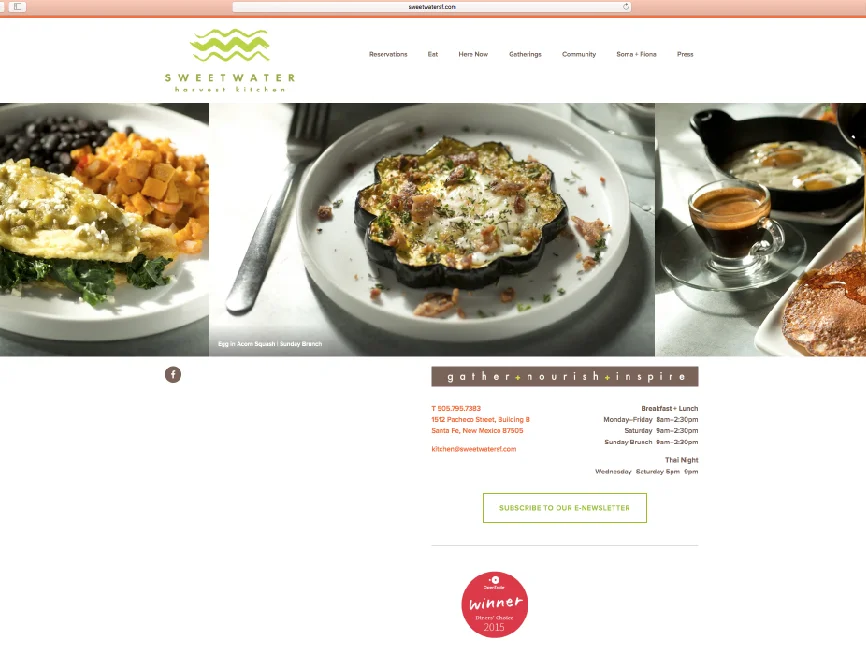
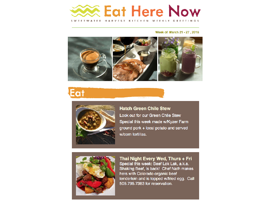
sweetwater harvest kitchen
- Identity Signature and Color Palette Refresh
- Website Redesign
- Email Template Redesign
- Menu Cover Redesign
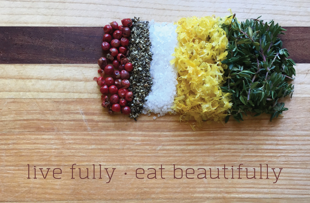
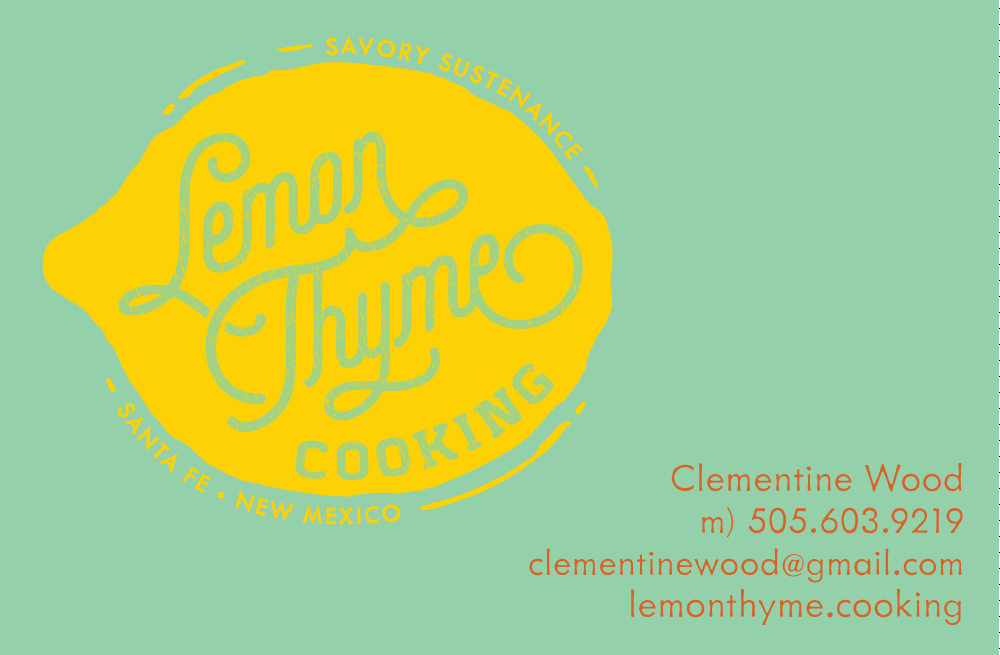
lemon thyme cooking
- Brand Strategy Workshops
- Identity and Touchpoint Development and Design
- Cover Image Photography
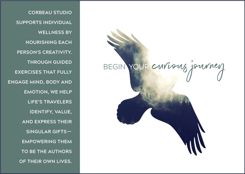
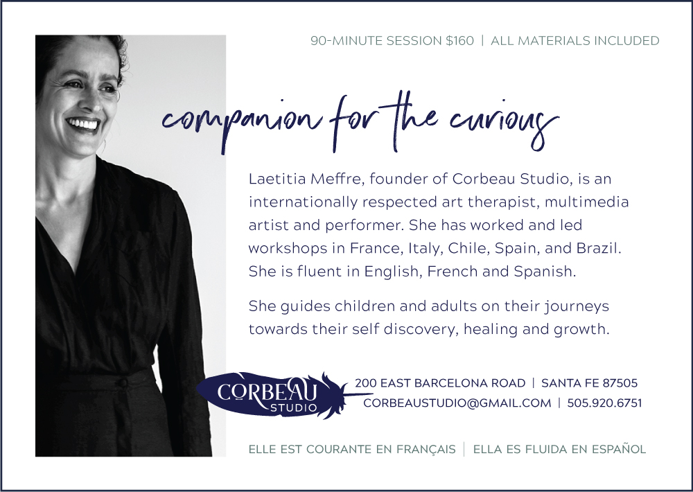
corbeau studio
- Brand Strategy Workshops
- Naming and Tagline
- Identity and Touchpoint Development and Design
- Launch Planning
jiggy jog press
- Brand Strategy Workshops
- Tagline
- Identity Design
- Website and Motion Graphics
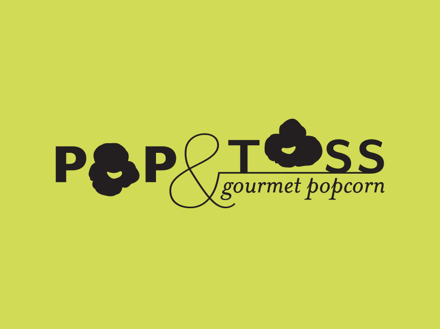
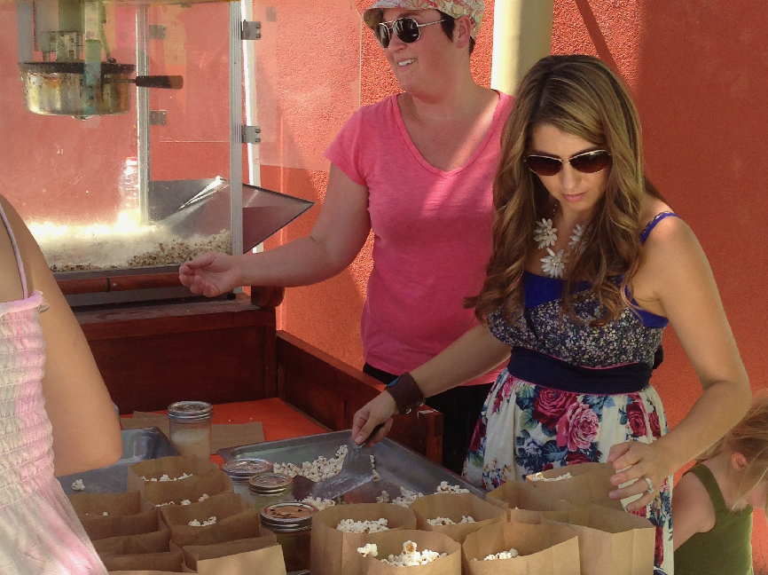
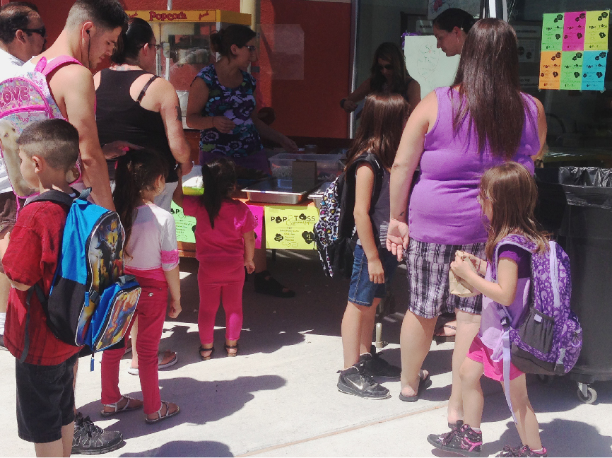
pop & toss
- Identity Design
- Advertising Display Design